shadcn/ui
Copy-paste component library built on Radix UI and Tailwind
- Best for
- React projects using Tailwind CSS
- Pricing
- Free and open-source (MIT)
- Stack layer
- Frontend Stack
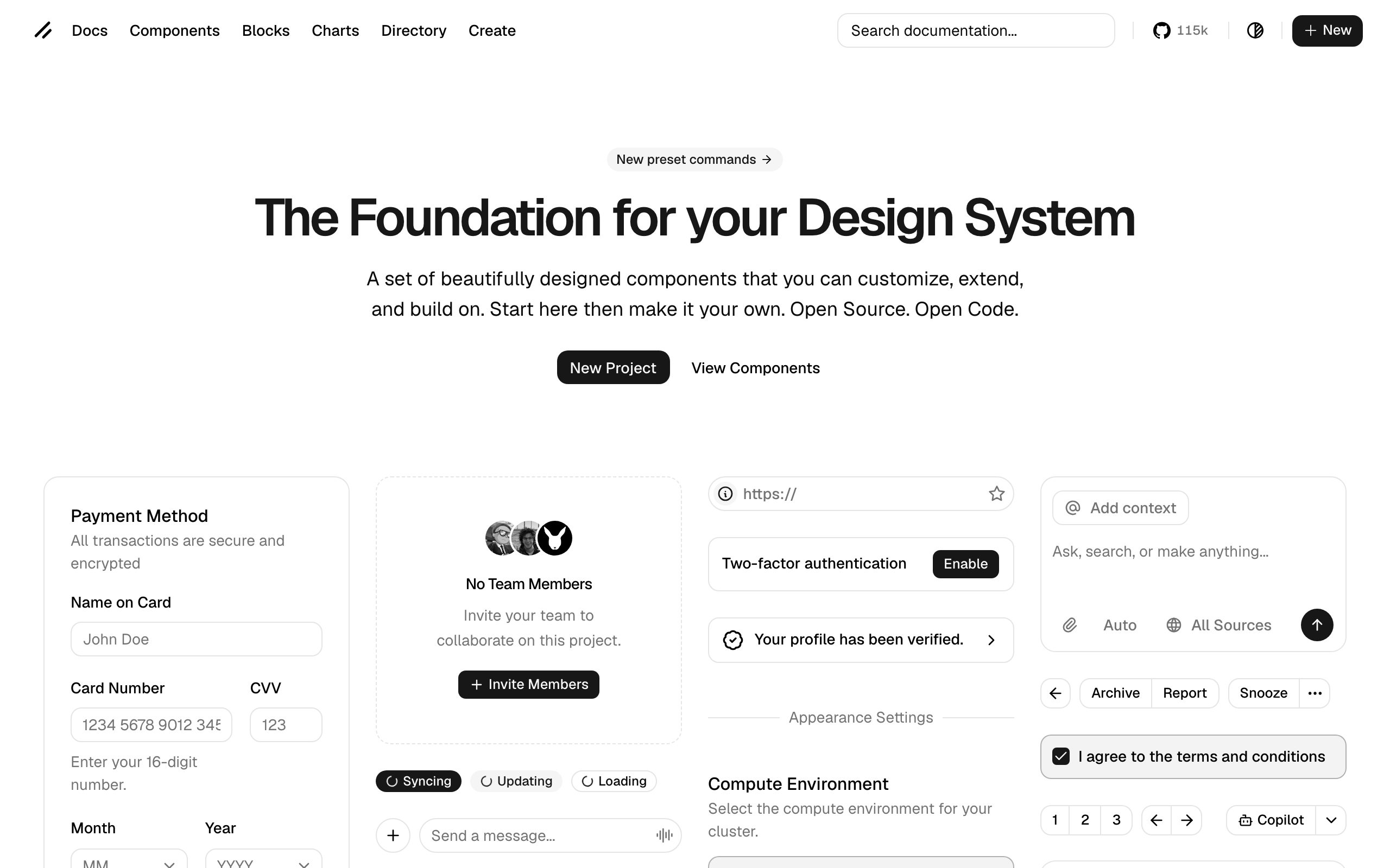
Live preview of ui.shadcn.com
Overview
shadcn/ui reimagined component libraries by rejecting the traditional npm package model. Instead of installing a dependency you cannot modify, you copy component source code directly into your project. You own every line, customize freely, and never deal with version conflicts or breaking changes.
The components are built on Radix UI primitives, ensuring accessibility and keyboard navigation work correctly out of the box. The styling uses Tailwind CSS and CSS variables, making theme customization straightforward - change a few variables and every component updates consistently.
The CLI makes adoption effortless. Run a command, select components, and they appear in your project with all dependencies resolved. Need a Button, Dialog, and DataTable? Three commands and you have production-ready components.
Key Features
Copy-Paste Model
Own the source code - no package dependency to manage
Radix Primitives
Accessible, keyboard-navigable components by default
Tailwind Styling
CSS variable theming with Tailwind utility classes
CLI Installation
Add components to your project with a single command
60+ Components
Buttons, dialogs, tables, forms, charts, and more
Full Customization
Modify any component to match your exact design needs
Why We Recommend shadcn/ui
shadcn/ui is our default component library for every React project. The copy-paste model means we always have full control, the Radix foundation ensures accessibility, and the Tailwind styling integrates perfectly with our stack.